
- Home
- New
- Data
All Datasets
Search by discipline
Search by data type
Search by temporal resolution
Search by time coverage
- Projects
Argo Products
 OFES
OFES Climate Indices
 Hawaii Regional Forecast
 Hawaii Regional Climate Model
 Hawaii Regional Ocean Model
 Hawaii Regional Page
 High Wind Occurrence
 iROAM
iROAM LADCP
LADCP Mean Dynamic Ocean Topography
 Monsoon Monitoring
 Pacific Argo Regional Center
 PRIDE
PRIDE Paleoclimate Modeling
 Precipitation Prediction System
 SCUD
SCUD Science on a Sphere
& Magic PlanetSPEArTC Statistical Downscaling
- Servers
Web-based servers
OPeNDAP servers
- Tutorials
- IPRC

LAS 8
How to use the LAS 8.
If you don’t know what datasets are available at the APDRC, there are several ways to discovery data. They are described in How to search for data.
Select a dataset on a LAS 8 page:
- APDRC Public-Access Products
- Earth Simulator Products
- APDRC Internal Access Products (password required)
- Earth Simulator Products for IPRC (password required)
Examples:
- Plot a graph
- Download dataset in NetCDF format
- Plot a time series graph
- Plot an animated graph
- Plot a compare graph
- Plot an average region time series graph
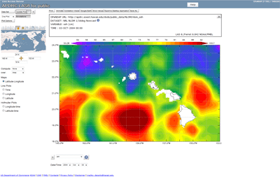
1. Plot a graph
If for example, you wish to access NLOM Nowcast sea surface height data on the public server, you would click the "Dataset" button.
Click "+" on "APDRC Public-Access Products" then Click "+" on "Assimilated Model Output" followed by Click "+" on "NRL NLOM 1/16deg Nowcast" and Click "ssh".
The tree structure will look like this:
- APDRC Public-Access Products
- Assimilated Model Output
- NRL NLOM 1/16deg Nowcast
- Assimilated Model Output
This first example shows how to make a XY plot. Select the geography region and times of interest:
- Default options:
- Maps: Latitude-Longitude
- Type Lon-Lat:
24
195 207
18
It will automatically change to:
24.0 N
165.0 W 153.0 W
18.0 N
- Select Date/Time: 2004 Oct 03
- Click "Update Plot" button
- It will plot the graph.
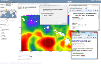
2. Download dataset in NetCDF format
This example shows how to download a NetCDF file from the first example. Please be aware of the size of the resulting NetCDF file. You may have to make several files divided in time or space.
- Follow the same steps as the first example.
- Click the "Save As" options will show a page in a new window.
- Selected Region (already selected from the previous steps):
Longitude range: [-165, -153]
Latitude range: [18, 24] - Select a Data Format: NetCDF
- Select Time: 2004 Mar 03
2004 Oct 03 - Click "Save"on the download page
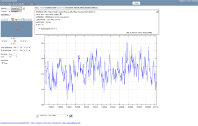
3. Plot a time series graph
The following example shows how to make time plot for a station dataset. Select 1 station in the dataset UH Sea Level > daily:
- Select the HONOLULU, U.S.A. Hawaii
- Default options:
- Line Plots: Time
- Default time range: 1985 Jan 01
2013 Dec 31 - Click "Update Plot" button
- A time series plot will appear. The time axis will adjust based on data availability.
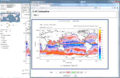
4. Plot an animated graph
The following example shows how to make animated plot. Select the dataset Surface CUrrents from Diagnostic model:
- Select the u current
- Choose "Animate" button on the top bar
- Click "OK
- It will pop up new window
- Choose Time Range: 1999 Aug 01
1999 Aug 05 - Click "Submit" button
- It load the images
- A animated graph on the new window will appear with time range from Aug 1 - 5, 1999.
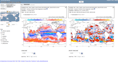
5. Plot a compare graph
The following example shows how to make animated plot. Select the dataset Surface CUrrents from Diagnostic model:
- Select the u current
- From dropdown menu on the top left menu, Change "One Plot" to "Compare 2"
- It will display 2 plots.
- Change the date on the left side to different date: 1999 Aug 05
- Change the date on the right side to different date: 1999 Aug 06
- Click the "Update Plots" button
- Click the "Difference Mode" button to see the difference of the 2 graphs on the right side:
- VARIABLE: Difference of u current (m/s)
- TIME: 06-AUG-1999 00:00 minus 05-AUG-1999 00:00
- It will plot 2 graphs with left side as difference mode.
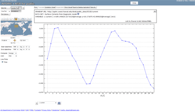
6. Plot an average region time series graph
The following example shows how to make animated plot. Select the dataset Surface CUrrents from Diagnostic model:
- Select the u current
- On the map, draw a rectangle region
- Change the dropdown menu on Compute: "None" to "Average"
- Leave dropdown menu on over: "Area" and Line Plots: "Time"
- Change the Start date/time: 1999 Aug 01
- Change the End date/time: 1999 Aug 31
- Click "Update Plot" button
- It will plot a time series graph with average u current on the selection region over the time.
The APDRC may be acknowledged as follows: Data provided by
Asia-Pacific Data Research Center, |
Questions, Comments? |